Bradley
Taylor
Real Estate
Group.
Project Type
Freelance
Branding
Social Media
Contributors
Designer:
Cody LaFond
My Contribution
Creative Direction
Logo Design
Visual Identity
Style Guide
Social Graphics
Sheet of paper featuring the Bradley Taylor logomark lying on a wooden table.
Bradley Taylor.
The man himself.
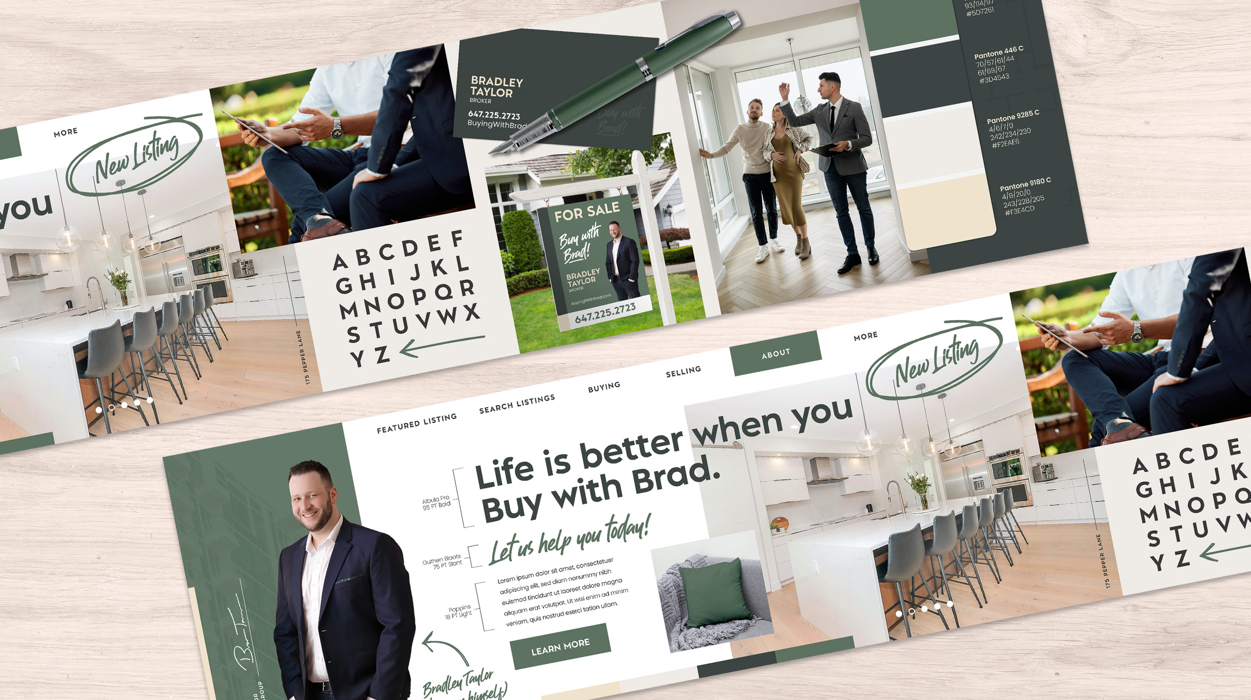
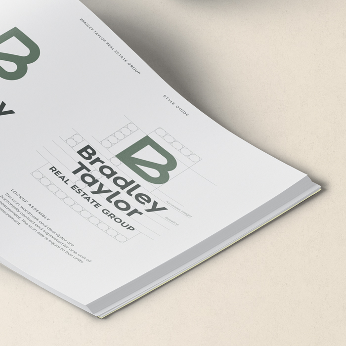
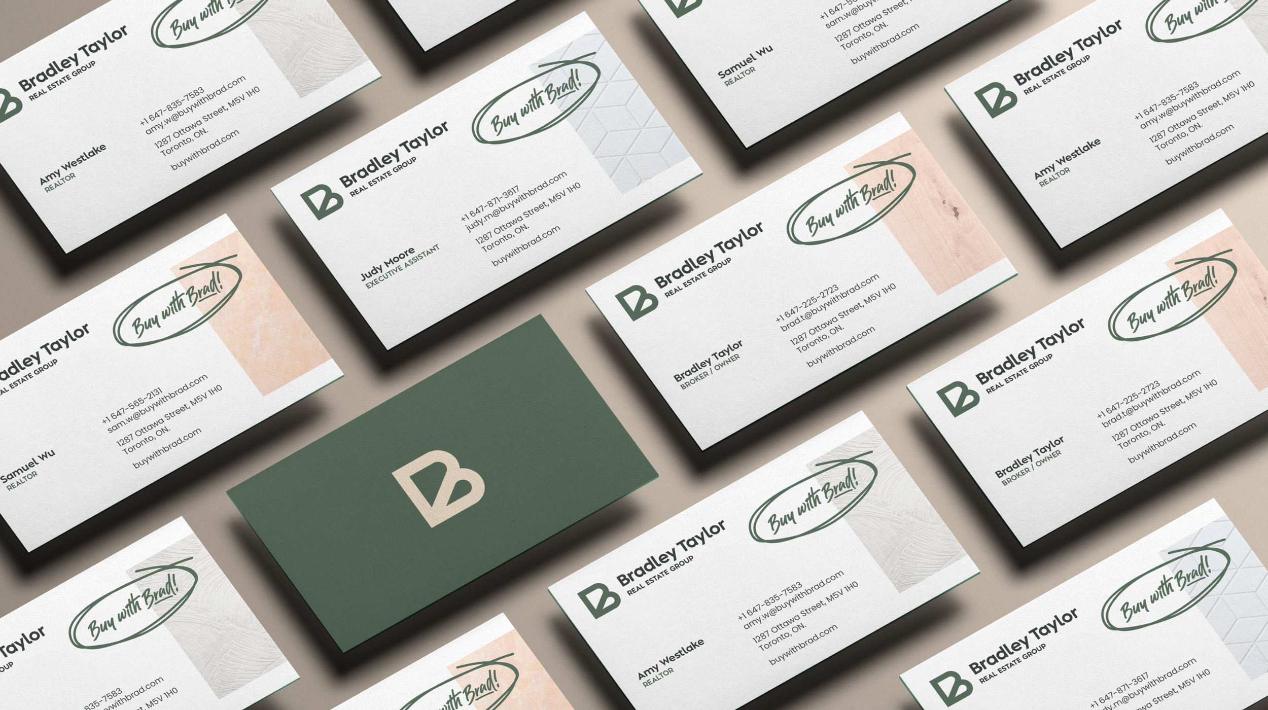
When I was first approached by Bradley Taylor, a savvy real estate broker from Whitby, Ontario, I quickly understood that the two of us were a good fit. Having operated primarily through word of mouth, the client felt it was time to put their best foot forward and really demonstrate that they’re the right choice for real estate services by committing to rebranding, and taking his first steps towards starting his own brokerage.

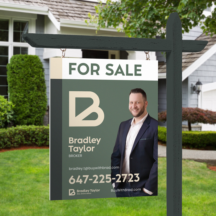
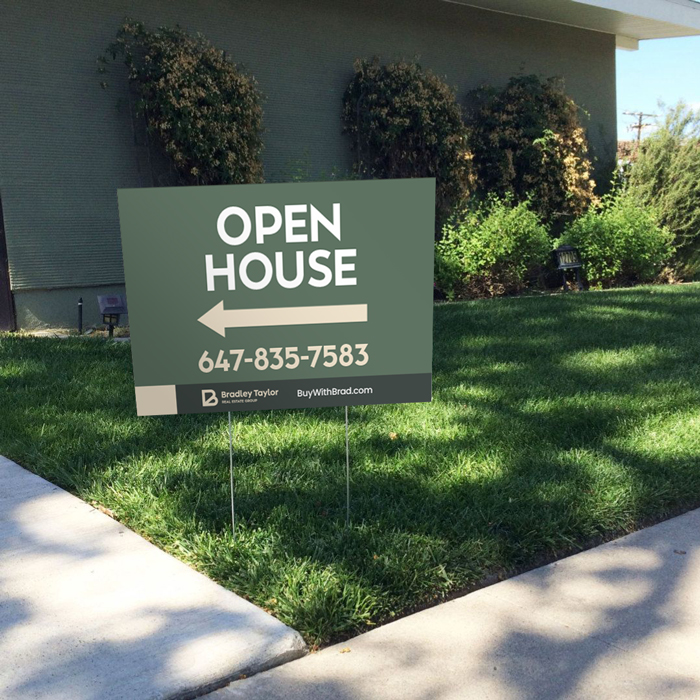
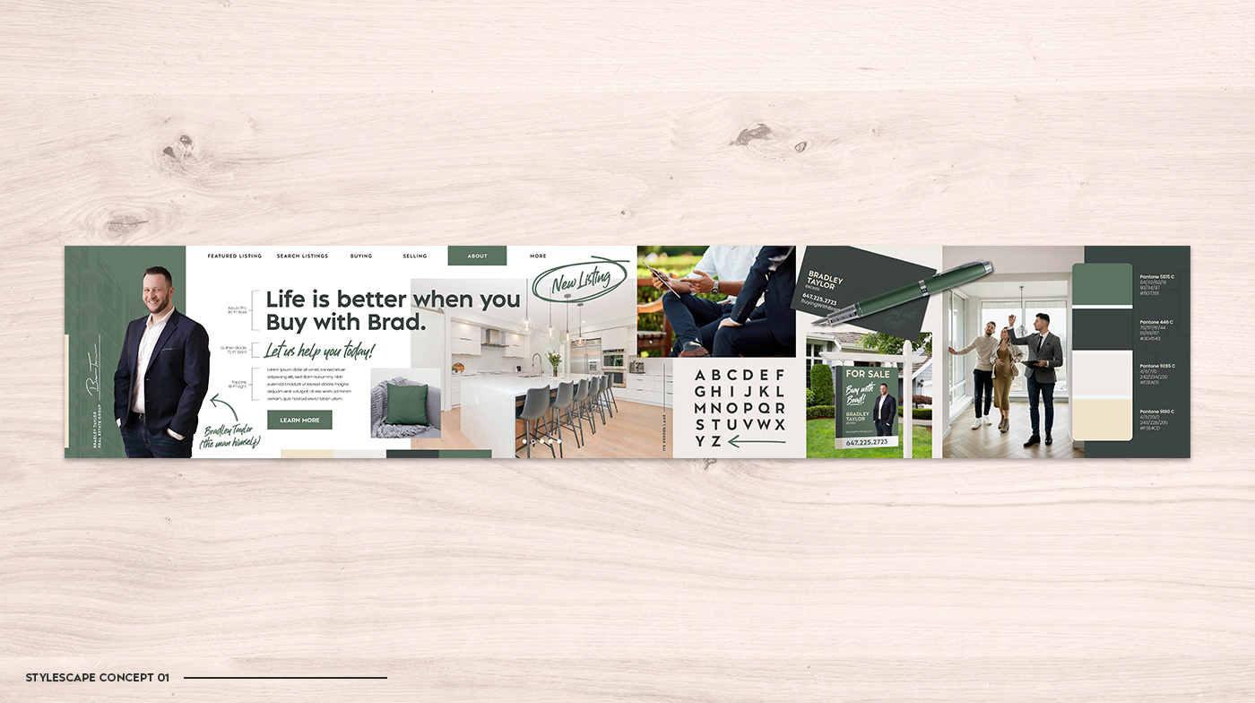
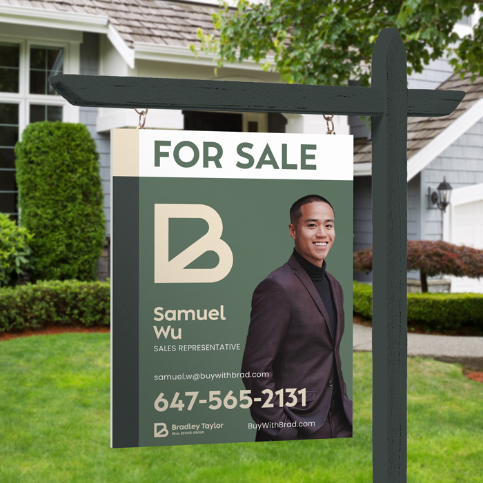
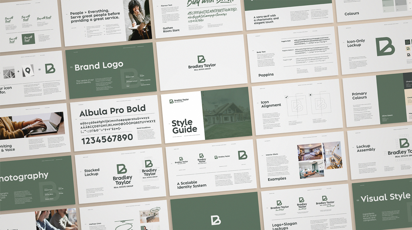
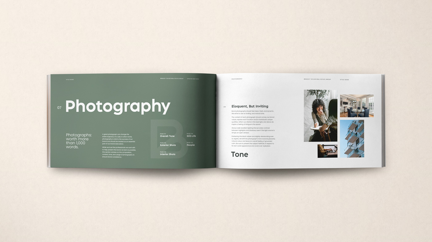
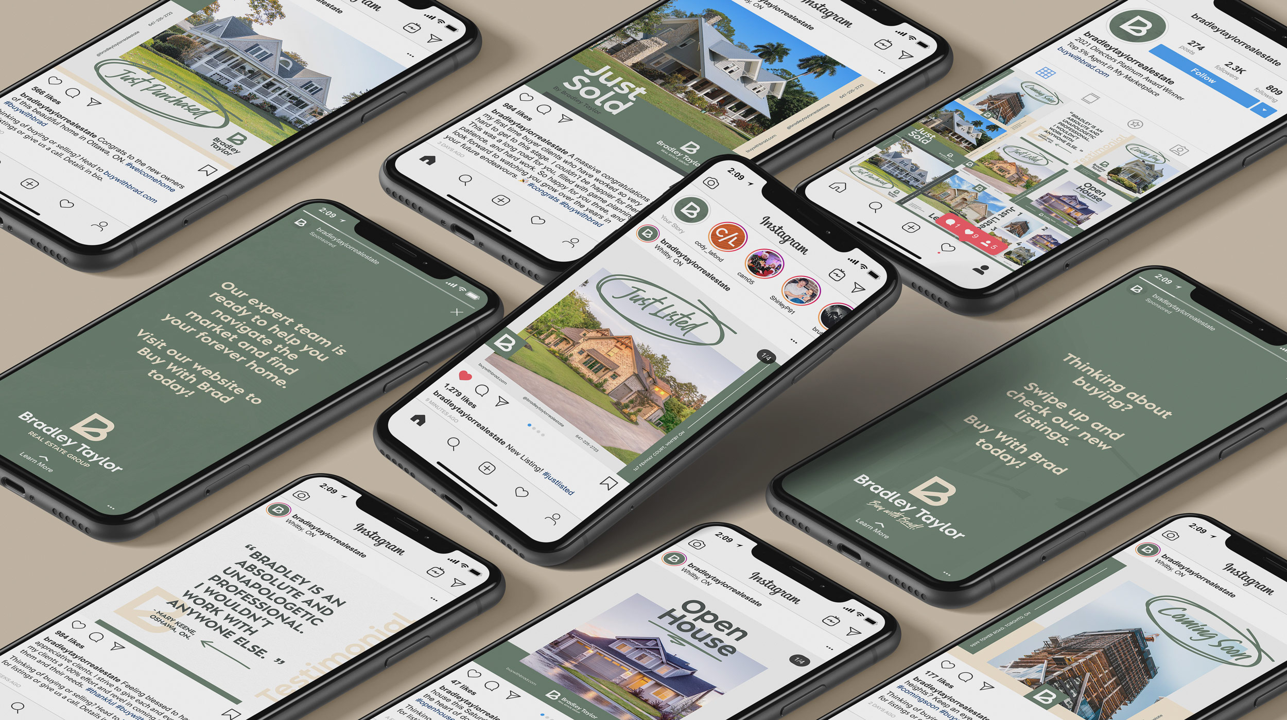
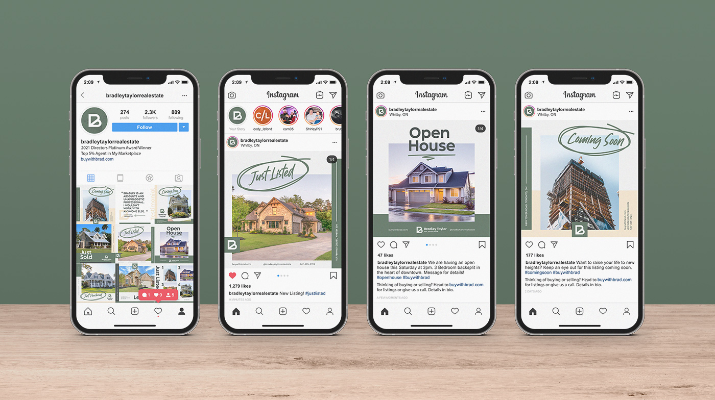
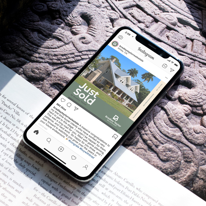
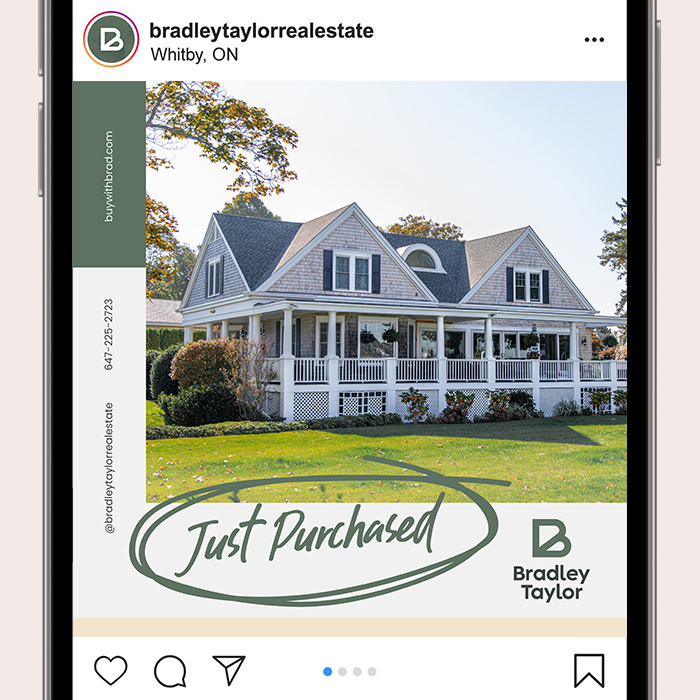
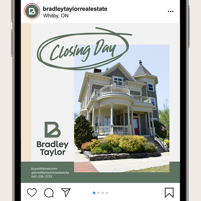
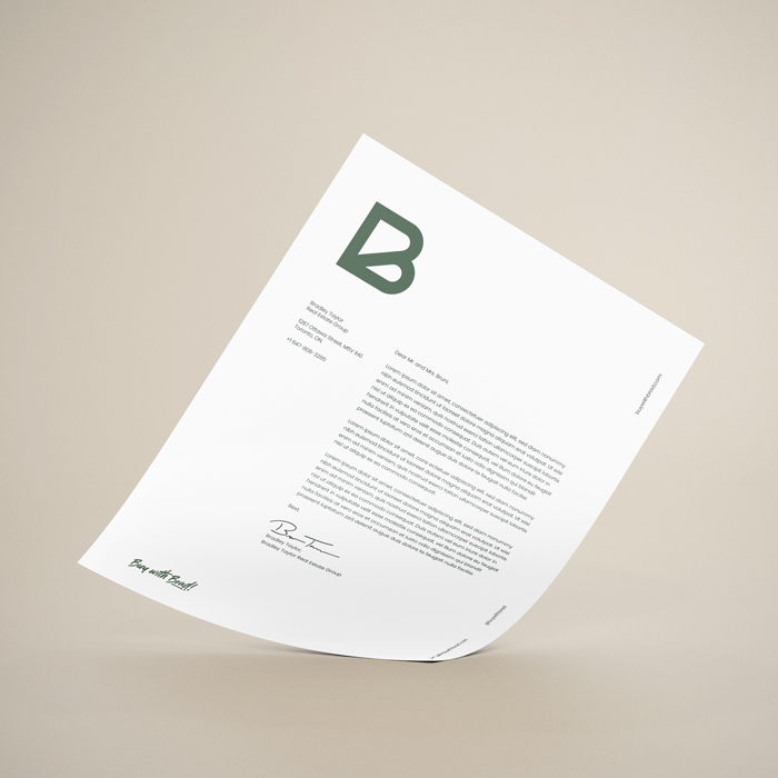
While a realtor/brokerage’s offerings can change due to a number of factors, Bradley makes a point to always provide full service representation for all his clients. This includes staging, professional cleaning, media (photos, videos, online tours), social marketing, targeted ads—the works. His full service mentality creates a unique positioning within the industry which set him apart from his competition which we certainly wanted to leverage to his advantage.

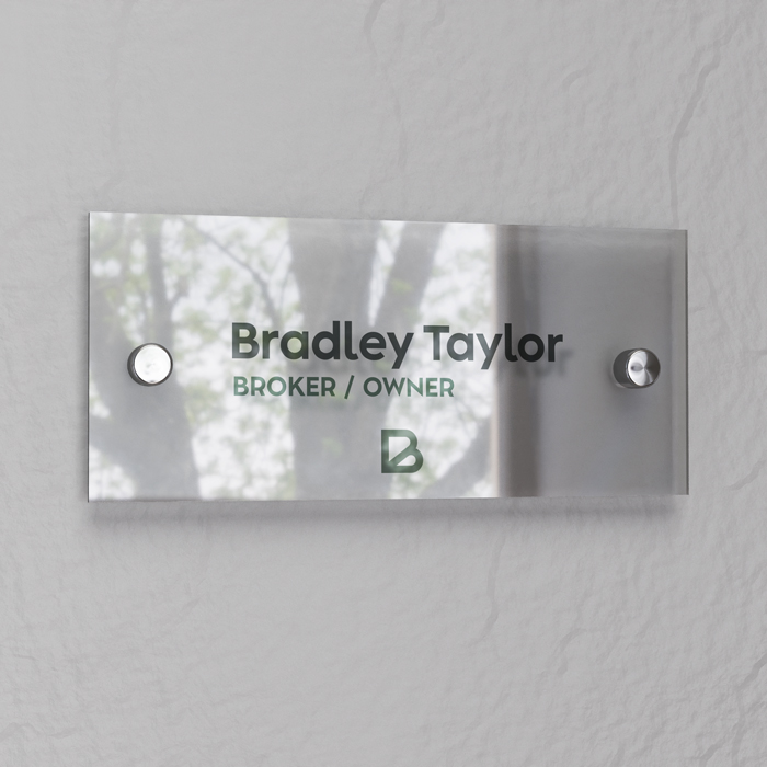
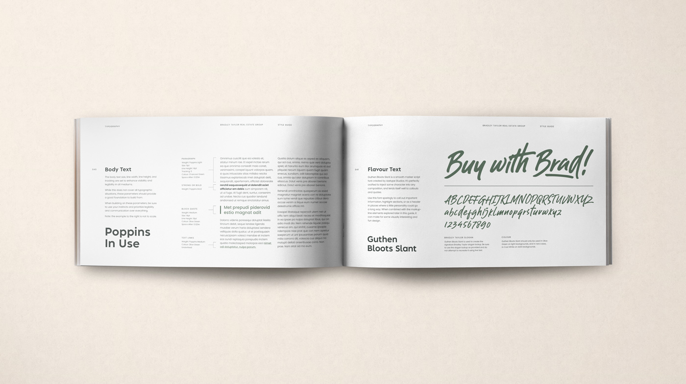
Operating largely within the Durham Region—one of the hottest housing markets in North America—we understood that the saturation of the industry exacerbated the importance of being able to stand out amongst the competition. The vision for what became Bradley Taylor Real Estate Group was one of a brand that exuded competency, trust, accountability, diligence, sincerity, and most of all—approachability. These attributes would ensure that Bradley had a great chance to win the hearts of clients-to-be and motivate them to "Buy With Brad".
Bradley Taylor real estate lawn sign showing Bradley Taylor.Real estate lawn sign reading "open house" with an arrow directing towards the property.
Bradley Taylor logomark appearing as a vinyl sticker on a storefront window.
Bradley Taylor logo displayed on an office wall.Executive office nameplate reading "Bradley Taylor" which features the Bradley Taylor logo.
Close up shot of the Bradley Taylor stylescape.
An hour of planning can save you hours
of doing.
Most, if not all, projects start the same way: with research, strategy and planning. That can come in many forms, but for my process it almost always includes some form of moodboard and/or stylescape. Shown here is the stylescape for Bradley's proposed rebrand which was approved and then implemented.

The chosen direction celebrates a modern, light-hearted look with photo and graphical elements that play about the grid in a fun yet structured collage-like style. The elements overlap and interact in deliberate and interesting ways while making use of a healthy amount of negative space. A hand-written script accompanied by hand-drawn ‘mark-up’ elements are dotted throughout the visual identity, reinforcing the personal-touch concept at the heart of the brand and providing a sense of connection with each and every interaction.

A contemporary geometric sans-serif serves as a friendly primary typeface, while the colour palette features primarily the liberal use of a desaturated olive-like green. A supporting cast of charcoal, cream and warm-grey serve as secondary colours.
Full shot of the Bradley Taylor stylescape laid on a table.
“Vectors are free — fill up that big ol' artboard with 'em.”
- Aaron Draplin
After the stylescape phase was complete, we then moved onto the logo design phase which was central to the rebrand. Having identified the visual identity of the brand, we used this knowledge to inform on the new logo. As always, when the logo design was completed I found myself with an artboard peppered with many different iterations before ultimately deciding on the strongest. When working I often think of the Aaron Draplin quote "Vectors are free — fill up that big ol' artboard with 'em", and fill it up I did.

The new Bradley Taylor logo, like the previous one, is a monogram based on his name. However it was decided that the last name initial would be dropped in favor of an icon consisting of a single stylized letter 'B'. The brand recognition relies primarily on his first name ("Buy with Brad") and so incorporating the last name initial wasn't as important as ensuring brand recognition with a strong logomark.

From the onset of the rebrand and his transition from solo broker to running a brokerage, the client identified one crucial aspect of his rebrand—the ability to offer his sales associates a feeling of ownership over their efforts (he’s a great guy, isn’t he?). Having the brand icon revolve around Bradley’s first initial places less importance on the Bradley Taylor name itself, and instead provides the sales associates more of an opportunity to promote their merit as an individual while still contributing as a member of the team.
Computer screen showing many logo concepts.Arrangements of several logo concepts on an olive background with the final logo circled in white.
Bradley Taylor logo shown on a white background with shadows of a tree.
Bradley Taylor logomark with technical geometry outlined.
Bradley Taylor real estate lawn sign showing Amy Westlake.
Bradley Taylor real estate lawn sign showing Jonathan March.
Bradley Taylor real estate lawn sign showing Samuel Wu.
Before and after comparison of the Bradley Taylor logo.
Front and back cover of the Bradley Taylor style guide.
A simple way of saying complex things.
As with any brand, consistency is a large part of maintaining presence in the marketplace and sustaining a lasting impact. Ensuring that consistency is as important an aspect as any day-to-day function of the business, and thus the correct usage of each individual element of the brand is a key factor in its success.

A style guide was created for Bradley Taylor Real Estate Group to serve as a cardinal direction for any and all communications they produce. The nature of the business requires collaboration with a number of third party services that facilitate their business operations, including social media management, copywriting, graphic design, photography, and printing. Ensuring everyone is pushing in the same direction is crucial to the brand longevity and impact.

The style guide summarizes the complexity of the brand assets and their proper usage in such a way that doesn’t overwhelm, and informs the reader while remaining succinct. It outlines a path to success in each main discipline of brand communications while still allowing room for creativity to flow where applicable. The guide was created to be a living document, intended to be updated and maintained to coincide with the ebbs and flows of the brand and its needs over the years.
Assorted pages from the Bradley Taylor style guide laid out across a table.
Bradley Taylor style guide laying open on a table.
Corner page from the Bradley Taylor style guide book.Cover page from the Bradley Taylor style guide book.
Collection of iPhones showing Bradley Taylor social media graphics created for Instagram.
Doing it for the' gram.
A key driver in the client’s business is social media marketing. The ability to share their efforts and reinforce the brand presence on a daily basis is a huge part of the industry, and being ahead of the curve means leveraging these tools to the best of their ability in order to be on a level playing field with their competition.

Funnily enough, the entire rebrand had humble beginnings as an effort to simply bolster the client’s social media presence. It was something that had been in the works since the beginning and was the most easily identifiable area in need of improvement. However, throughout the discussions it was decided that investing into social media marketing with shaky branding wouldn’t maximize the impact of our efforts, and so after some deliberations we elected to go full bore into a total rebrand and make our efforts really count. 

The results of the social media overhaul are a collection of graphics that allow the sales representatives to pull from a library of templates to suit their needs. Now in place of posting a simple image that sports a logo in the bottom corner, they now are reinforcing the brand with each post, utilizing a designed piece that speaks to the Bradley Taylor brand and exudes its attributes while still serving the purpose of driving traffic to a sale, a client testimony, or any initiative they choose to highlight in the course of their daily activities.
Four iPhones showing Bradley Taylor social media graphics created for Instagram.
An iPhone laid across an open book displaying a Bradley Taylor Instagram graphic
Instagram graphic created for Bradley Taylor.
Bradley Taylor business card arrangement showing several cards.
Buy with Brad!
The conclusion of this project marked a great moment for myself and Bradley Taylor Real Estate Group. It was a pleasure and a privilege to bring in this great organization and provide them with the assets to go out and promote their best selves. Armed with the work we’ve created here, their outward image now accurately represents the great work Bradley has done all along, and serves as the catalyst for his expansion into the world of brokeraging. I’m thrilled with the outcome and excited to see how the brand develops and serves them for years to come. 

A special thank you to Bradley Taylor for being generous with his time and diligent in his collaboration throughout this process.
Arrangement of stationery created for Bradley Taylor.Letterhead design created for Bradley Taylor.
Arrangement of business cards created for Bradley Taylor.
Bradley Taylor logomark printed on textured paper.
Check out more
work below,
or go back to the top.