Therwood
Heating &
Cooling.
Project Type
Studio
Branding
Contributors
Designer:
Cody LaFond

Project Manager:
H. McKnight
My Contribution
Creative Direction
Logo Design
Visual Identity
The Therwood logo imposed over a flame
Too hot, too cold, or just right?
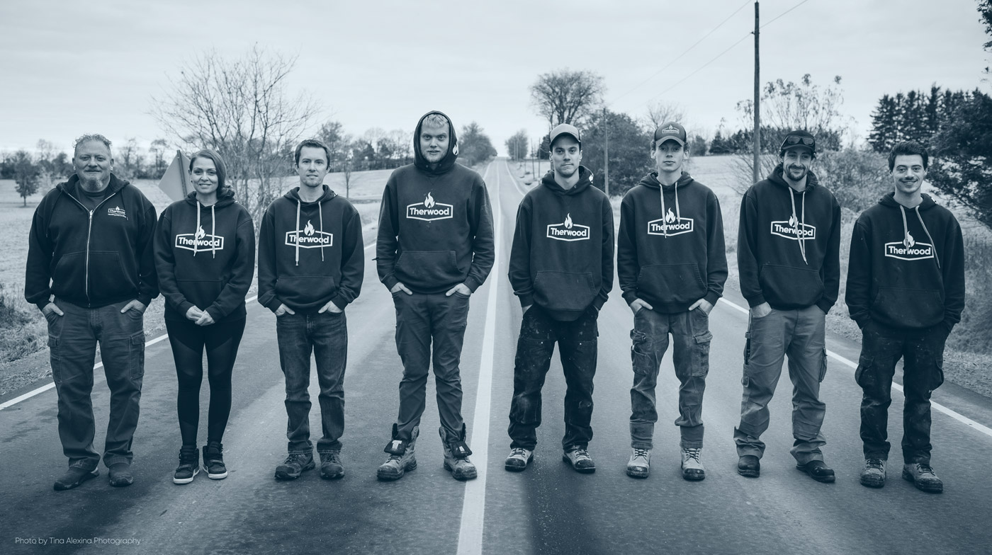
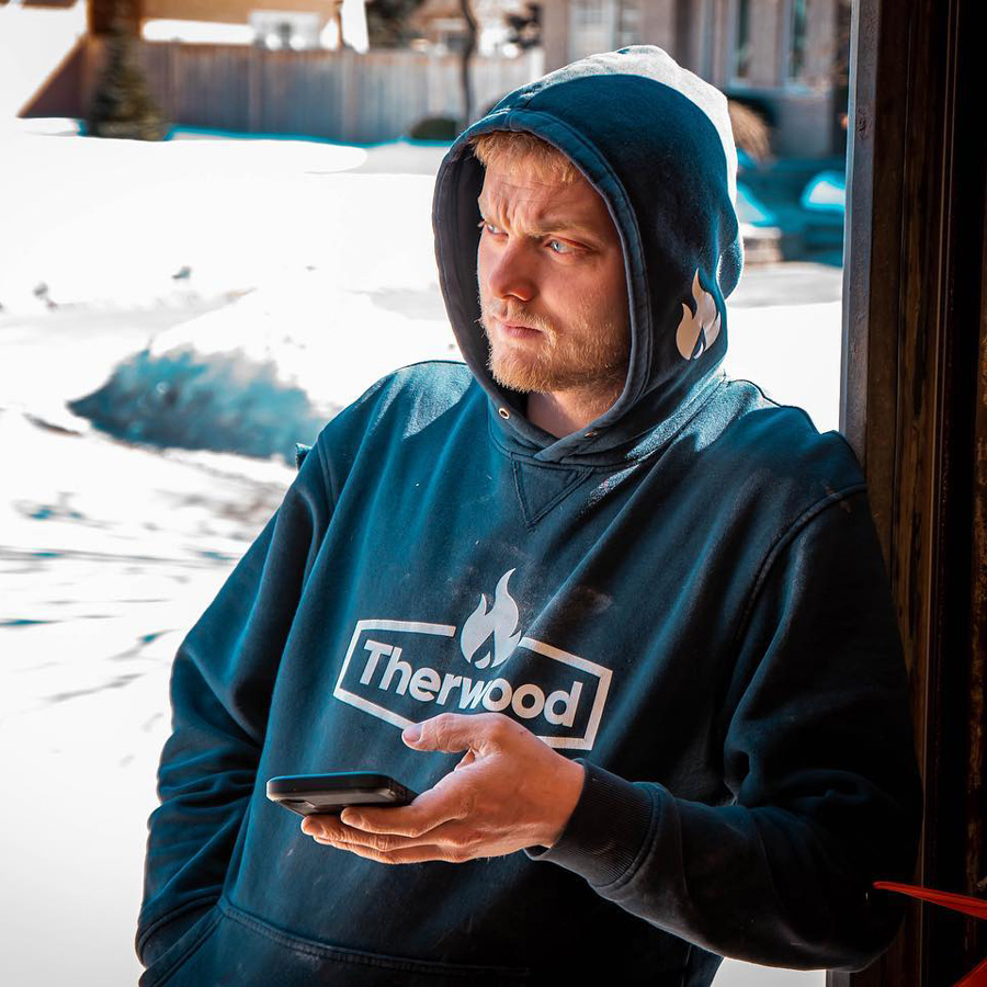
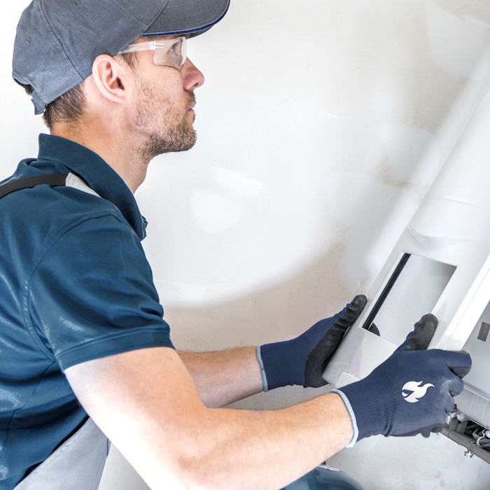
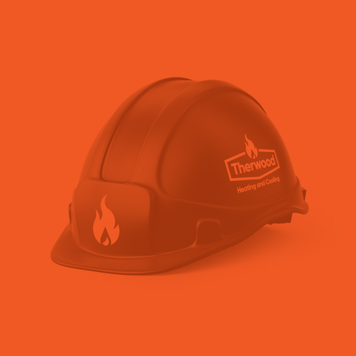
Therwood Heating and Cooling is a family owned business who specializes in HVAC repair and installation. They have proudly served the Uxbridge area for more than 25 years, and their team has a great track record of ensuring their customers’ expectations are not only met, but exceeded. However, when they approached us at Take Root Creative, they felt that their brand image was not quite reflecting the quality of work that they do so diligently, and asked if there was anything our team could do to assist them in putting their best foot forward.

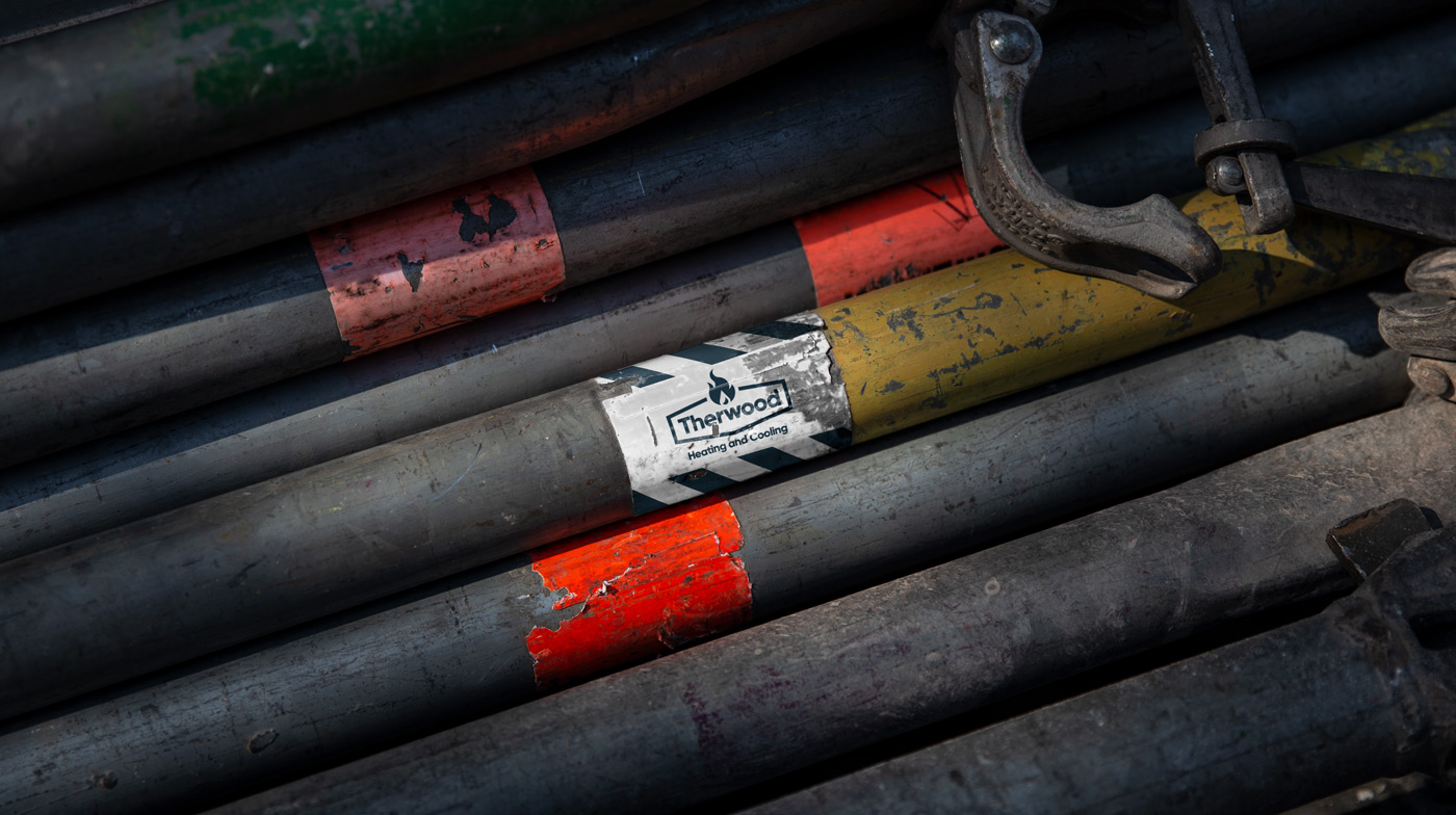
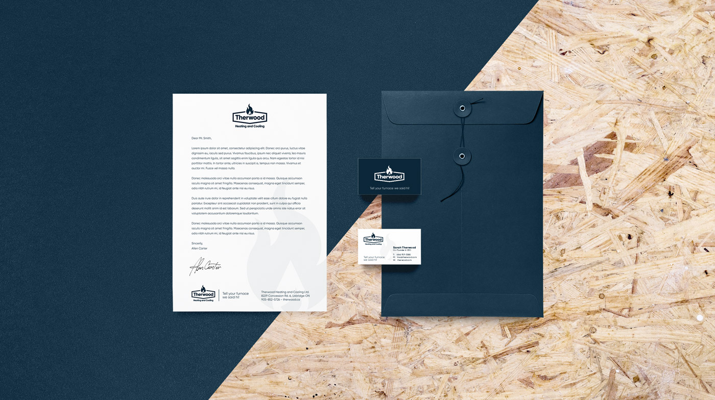
After a brief discovery period, it was determined that the best course of action would be to commit to a rebrand. They weren’t fully committed to their logo and visual identity as it stood, and we felt it wasn’t truly pulling its weight in terms of marketing their company. It didn’t particularly stand out amongst the competition and we knew there was room for improvement.  

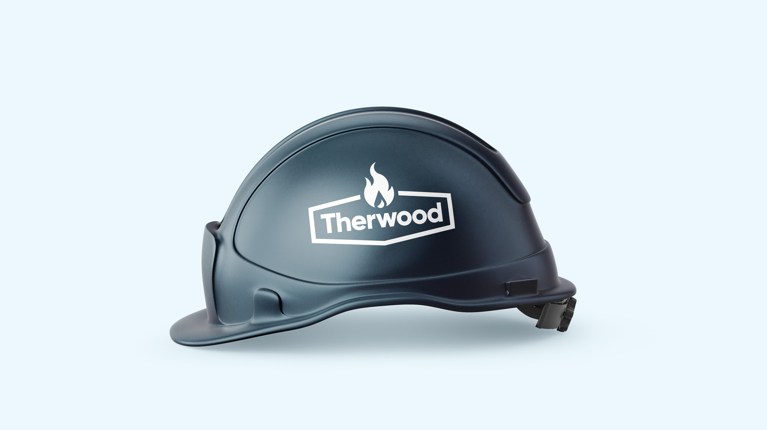
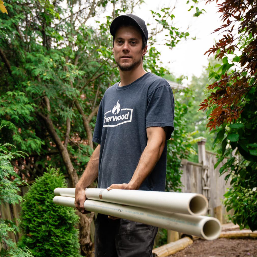
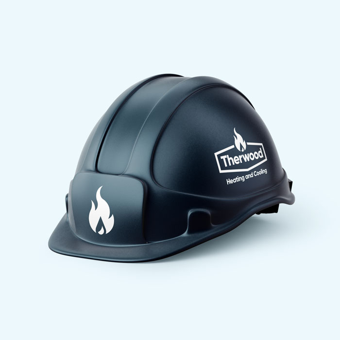
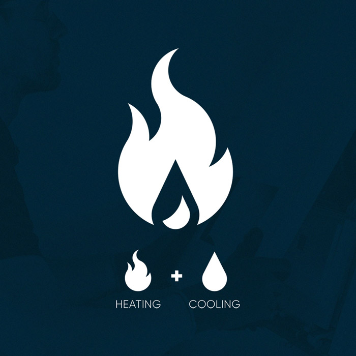
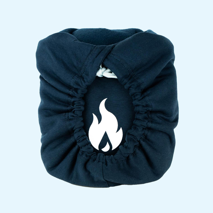
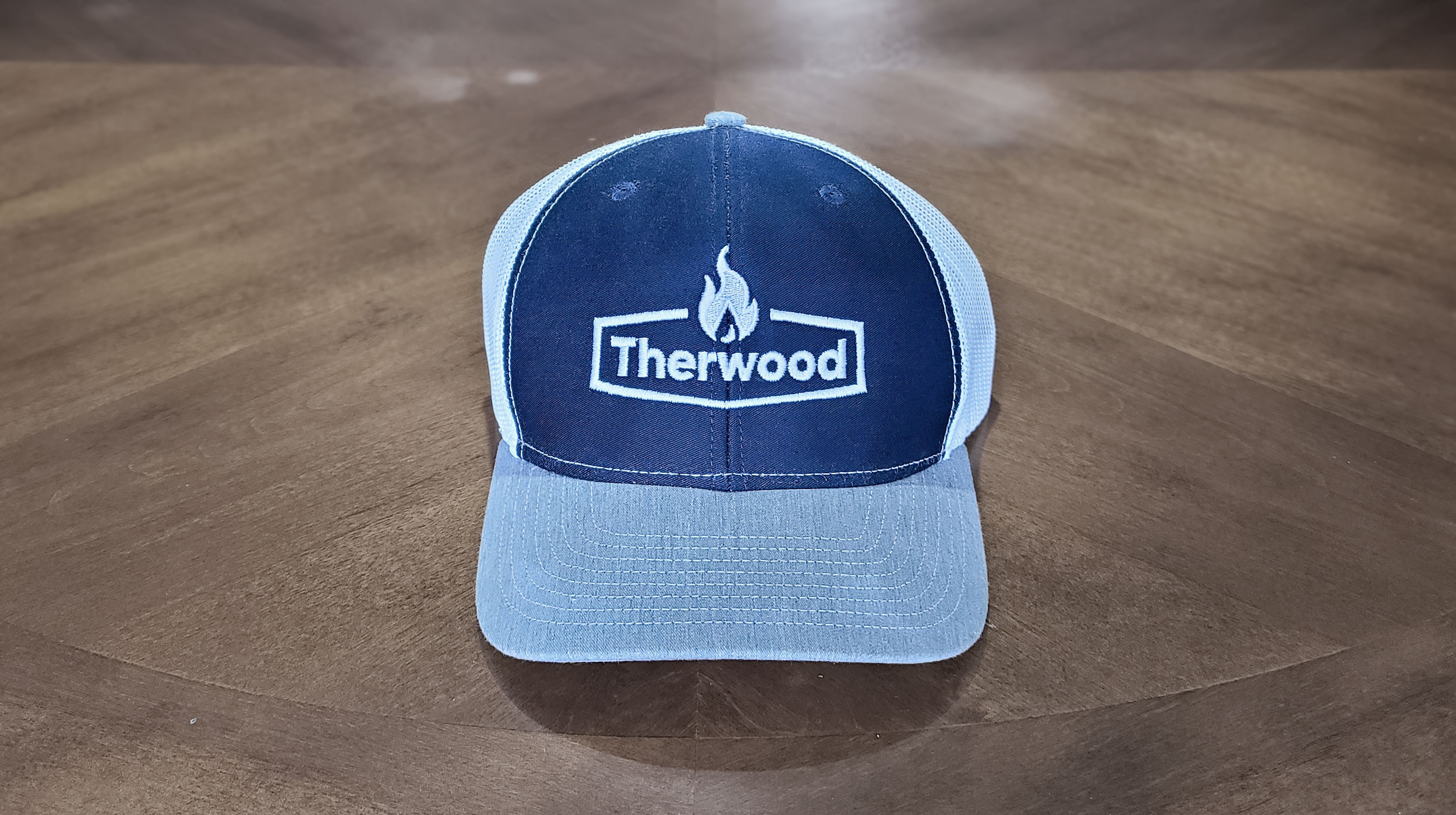
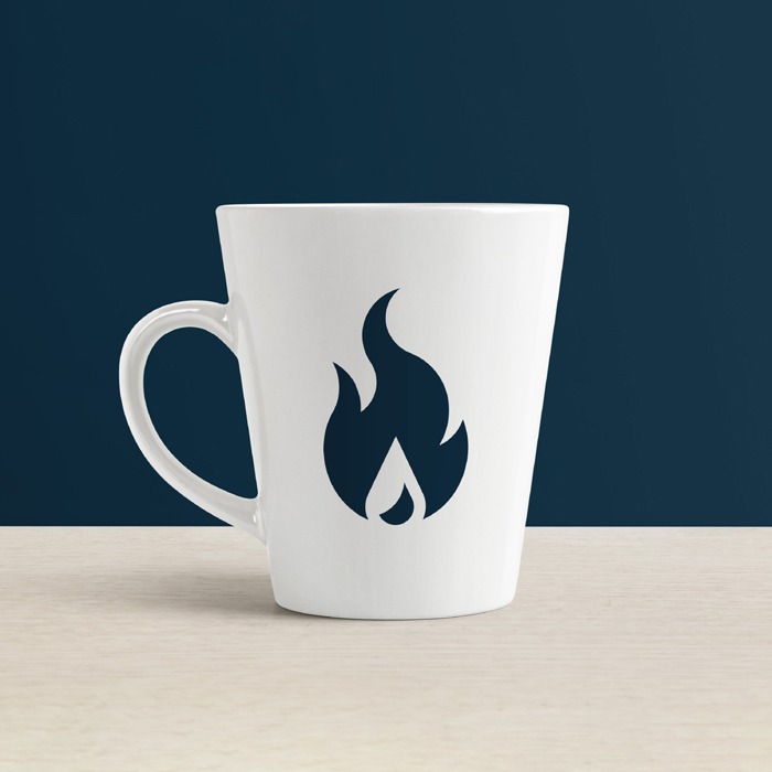
My challenge was as such: Create a new logo and visual identity for Therwood that exemplifies their focus on experience and reliability, exudes quality craftsmanship, and embodies the level of trust they instill in their customers through their exemplary customer service and sense of community.
Animated GIF of the Therwood logomark forming from 8 perfect circles.An air-conditioning unit.
A delivery man with a clipboard standing near his delivery van.
Therwood branded ID badgeTherwood sales uniform.
Therwood branded construction hard hat.
Feeling a little blue.
In our discussions leading up to the redesign, we came to the conclusion that a shift in colour palette would be a welcomed change of direction. The oranges and reds of the branding of old wasn’t quite emitting the feelings and emotions we wanted to prioritize for Therwood. While they can be associated with positive feelings of passion, excitement and boldness, they can sometimes too carry connotations of urgency, power and danger. These are certainly inopportune feelings to derive from a business working in gas and heating such as Therwood. 

We instead opted for an all-new colour scheme comprised of cool blues. A strong navy hue with an accompanying sky-blue felt much more appropriate for such a customer focussed, service based business. Trustworthiness, dependability, professionalism — this new palette emits these new positive emotions with ease, and instills confidence in Therwood’s customers to reassure them that choosing Therwood is the right choice.
Therwood employee with branded t-shirt carrying pipes.Therwood branded construction hard hat.
Work truck with Therwood vinyl decals.
Graphic displaying concepts behind the Therwood logomark.
Industrial air conditioning unit being lifted by a crane.
Industrial air conditioning unit on a roof.
Industrial air conditioning unit being lifted by a crane.
Therwood crew wearing Therwood branded sweaters
Show
me your badge.
From the onset of the project I was looking forward to redesigning Therwood’s logo. I had a few ideas up my sleeve, and after gaining an understanding of their target audience and day-to-day operations, I felt I could make something really special that spoke to their industry, their customers, and represent their team. 

I opted for a badge-style logo design that was reminiscent of service-based industries of the 1950’s and 60s, with a modernized twist as to remain relevant and speak to their customers in 2020 and beyond. A geometric sans-serif in the typeface Gilroy gives it a classic feeling while still retaining a certain sense of modernity. The logotype is enclosed within a six-sided border, with the lockup being completed by the addition of their new logomark centered above.

The logomark depicts both of Therwood’s specialties (heating and cooling) in the form of a flame, with a water droplet being formed in the negative space within. The logomark was constructed using 8 offset circles of differing sizes, overlapped in such a way that they create the curvature of the flames within the intersects. The culmination of these elements create a beautiful mark that shines in any situation, and has truly come to represent Therwood’s hard work and passion for what they do.
Therwood branded sweatshirt.Therwood employee with branded sweatshirt.
Therwood branded hat resting on table.
Tailgate of a Therwood branded truck covered with snow.Therwood employee fixing a furnace.
Therwood branded business cards.
Tell your furnace we said hi!
The client was ecstatic with the results. They wasted no time making use of the logo, creating uniforms, hats, and sweaters. I made sure to snatch up a hat of my own before they were all scooped up as they were quite the hot commodity. They also began spreading the new branding and logo lockups throughout their website and social media accounts, which was met with positive fanfare. They had vinyl vehicle wraps and print stationery created. Suffice to say they were excited to start their new chapter with their new visual identity at the helm.

A resounding success, this project serves as a reminder that even if the work you do necessitates getting down into the muck and getting your hands dirty, a fresh and clean new look for your marketing can work wonders in elevating your presence within the market. Almost any business has the potential to improve their standings within their community, and bolster customer relationships old and new with a little branding TLC courtesy of their friendly neighbourhood graphic designer. 

Therwood continues to employ this redesign to great success, and revels in the fact that their marketing now communicates the level of quality service they’ve been providing for over 25 years, and surely for many more years to come.
Therwood branded stationery.
Therwood branded business cards.Therwood branded coffee mug.
Comparison of the old and new Therwood logos.
Therwood logo resting on a blue background.
Check out more
work below,
or go back to the top.