Changing
the Face
of Cancer.
Project Type
In-House
Corporate
Editorial
Contributors
Designer:
Cody LaFond

Project Manager:
M. Millward
My Contribution
Creative Direction
Grid System
Layout
Sun Life Cancer Bright Paper resting on a yellow and white background.
Another Bright Paper by Sun Life Financial.
A play on ‘white papers’ (an authoritative report meant to inform readers concisely about a complex issue) Sun Life Financial’s (SLF) Bright Papers combine careful research and thoughtful analysis to help employers gain a deeper understanding of employee attitudes and behaviour. They outline what plan members want and expect, and what they believe is integral to helping them stay healthy, all of which is summarized in a concise booklet which is printed in large quantities and distributed to employers throughout North America.

Having produced several editions prior to this one, I had intimate knowledge about the construction and layout of your typical Bright Paper. It had become a rather defined workflow and followed a familiar format. However, this edition proved to be more than typical.

I was tasked with modernizing the Bright Paper layout from page of contents, to sources cited, and everything between. It was to be a brand new presentation that set the tone for SLF Bright Papers moving forward, and came on the heels of a company-wide brand refresh. A newly approved brand style guide and branded fonts presented an interesting opportunity for me to create something new and exciting as an in-house designer for Group Benefits, and so I set out to do just that.
Collage of various Sun Life Bright Papers.Turning the page of the Sun Life Bright Paper.
Front and back cover of the Sun Life Bright Paper.
Sun Life Bright Paper resting open on a surface.
Cancer:
A growing challenge.
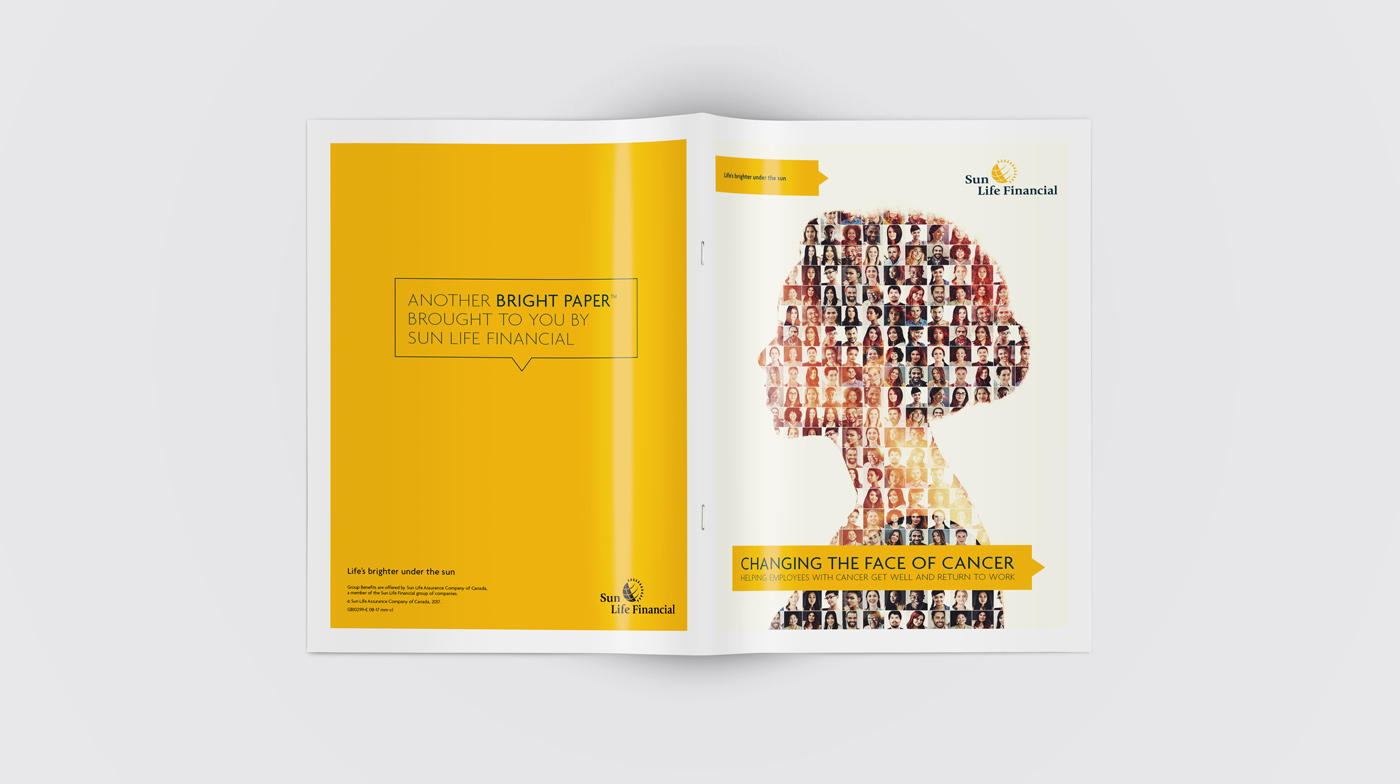
This Bright Paper marked a point of divergence from the preceding editorials in more ways than one. Brand standards and layout adjustments aside — the discussion focussing in on a disease such as cancer created a much heavier and more emotionally charged edition than those previous. Fraud, Healthy Lifestyles, Mental Health. None of these past topics seemed to carry the same level of emotional energy as this deep dive into the effects of cancer.  

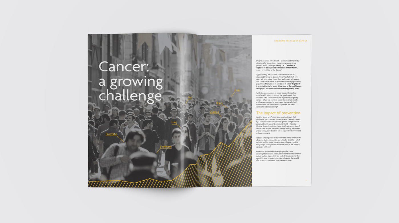
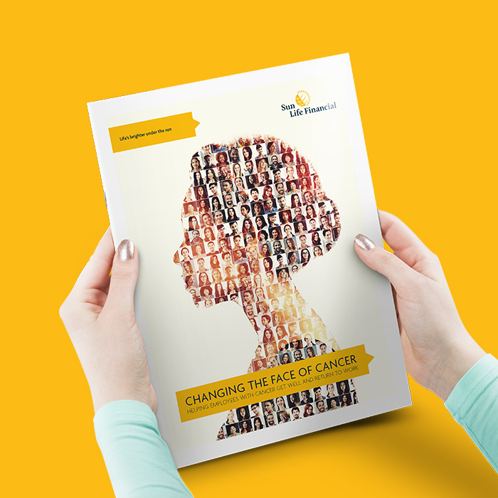
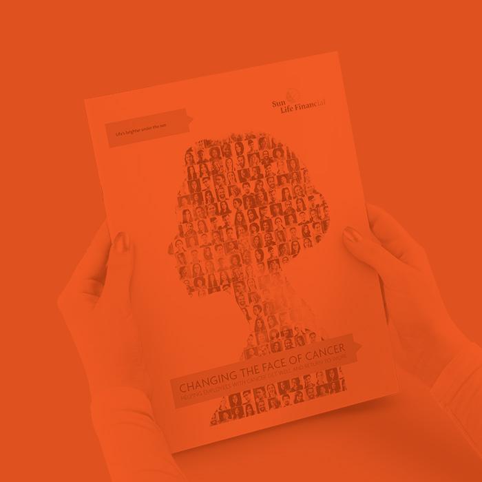
This presented to me a unique opportunity in that, for once, Sun Life Financial’s traditional optimism and bright tone felt a little out of place. The photos of happy families smiling, the liberal use of Sun Life’s trademark Pantone® 124 C yellow, the playful use of sun iconography — they all felt just a tad inappropriate for this particular instance.  I really wanted to do this publication justice and reflect the solemnity of the disease within the design while retaining the reader’s interest and remaining engaging, inviting and informative.

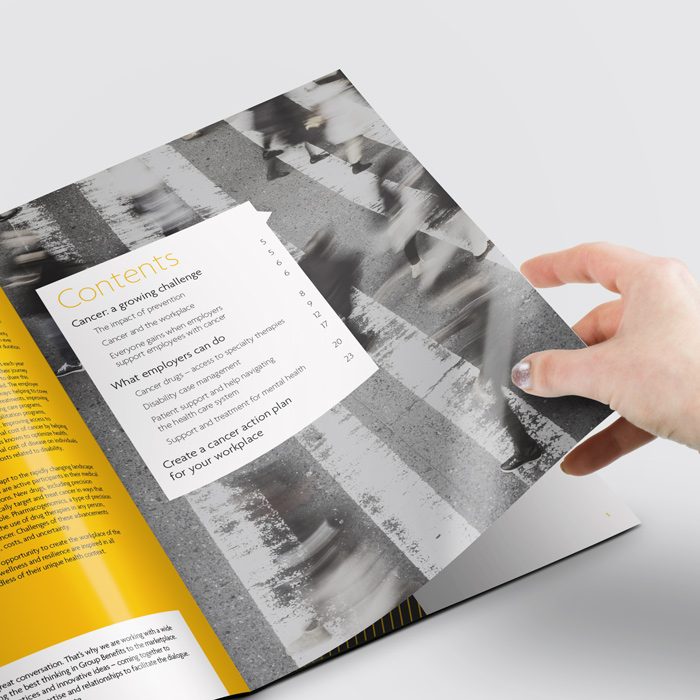
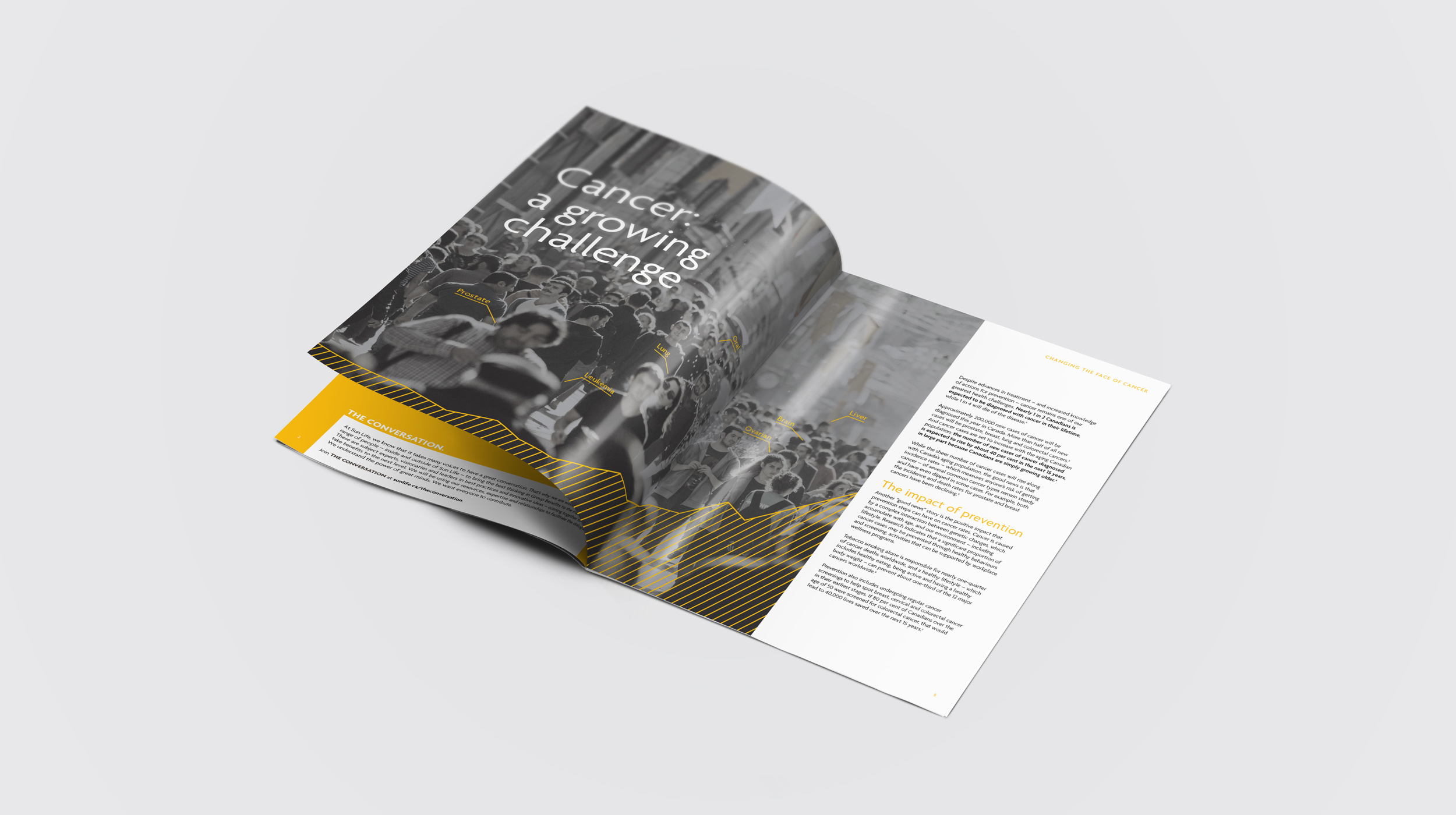
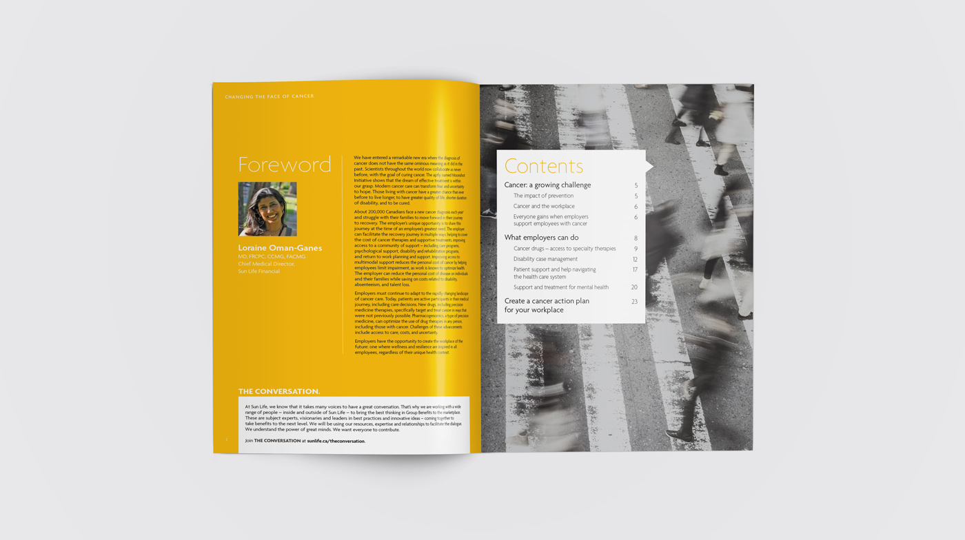
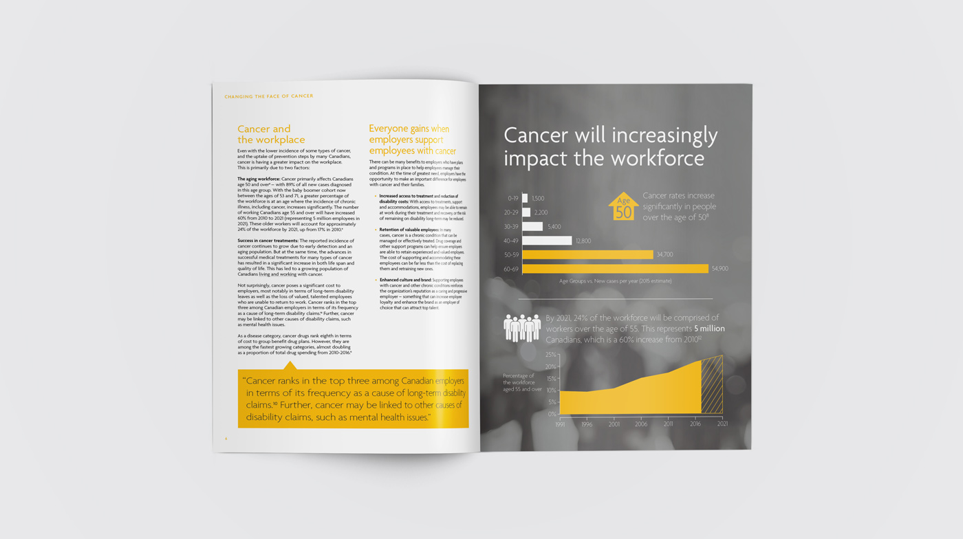
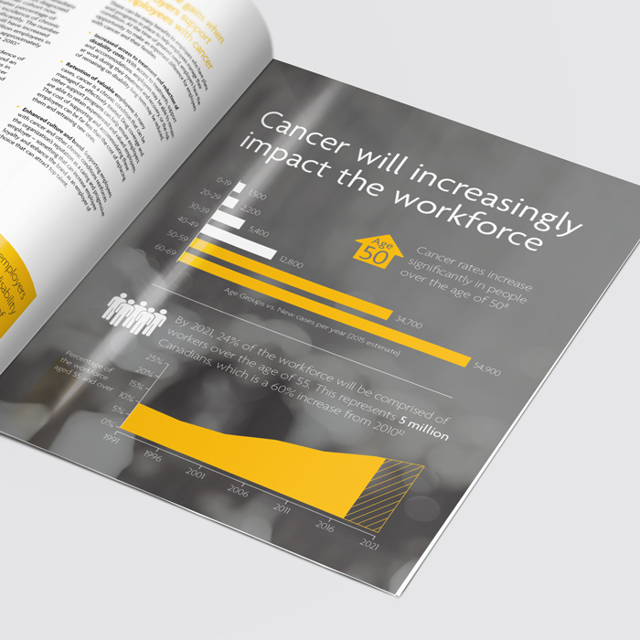
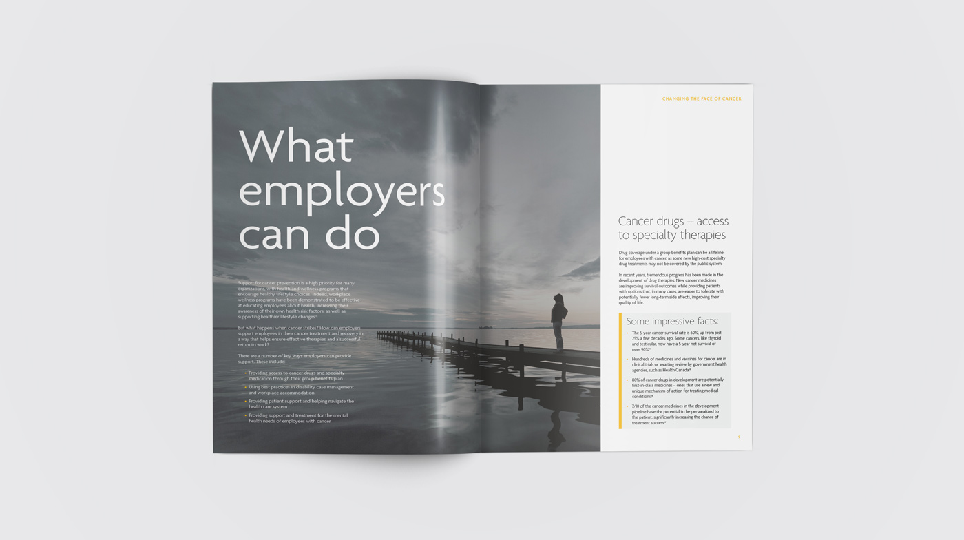
I shelved the secondary and tertiary brand colour palettes (blues, greens, violets etc.) and instead opted for a strictly muted colour scheme, leaning heavily into greys, charcoals and limited use of Sun Life’s famous yellow. I relied on desaturated images throughout that feature characters in an introspective light in an attempt to highlight their struggle with the disease, but also reinforce to the reader that they are not alone in their struggle.
Sun Life Bright Paper resting open on a surface.
Two Sun Life Bright Papers resting open on a surface.
Close up of infographic.Cancer Bright Paper resting in a person's hands.
Multiple Sun Life Bright Papers resting open on a surface.
An opportune time for change.
This project came during a period of change within Sun Life, who were in the midst of reviving and modernizing their brand guidelines. This Bright Paper marked one of the first examples of the new guidelines in action. I was very excited to be able to assist in enacting this change and put the newly minted style into production, especially in such an important legacy publication such as a SLF Bright Paper.   

The addition of greys and charcoals to the colour palette really allowed me to set the tone for this topic, and provided the opportunity to really exemplify their strengths as viable options within the new palette. From the onset I welcomed these additions, and wanted to prove how they would strengthen our toolkit as designers. It just so happened to coincide perfectly with the challenge presented to me in creating this Bright Paper (and having it reflect the topics therein), though I knew it would have more wide-spread applications beyond it.  

In addition to the change of palette, the brand typeface of choice experienced a face lift in the form of Sun Life Sans. Included with it was a new, lighter weighted version which sported a sleeker, more distinguished look. I didn’t hesitate to put this new variant to use, employing it in the form of headlines and pull-quotes throughout the publication. I found it added a certain sophistication to an already intriguing document and truly allowed the topic to shine through and communicate with the reader.
Multiple Sun Life Bright Papers resting open on a surface.
Sun Life Bright Paper resting open on a surface.
Close up of infographic.
Sun Life Bright Paper being held open by a person.
A trip 'round
the Sun.
The resulting feedback from this publication was overwhelmingly positive and its success was not only celebrated within Sun Life, but recognized externally by other industry players as well.

This marked a definitive high point in my tenure at Sun Life, not only for having worked on a highly successful editorial publication shaped largely by my design decisions, but also for having had the ability to facilitate a positive discussion on a topic which has touched me on a personal level.


Multiple Sun Life Bright Papers resting open on a surface.
Sun Life Bright Paper resting open on a surface.
Close up of full page image.Close-up of image.
Sun Life Bright Paper opened resting face-down on a surface.
Check out more
work below,
or go back to the top.